

11 March 2026
Artist Highlight - Riolab Ceramics
Interview and Review
Riolab Ceramics is a London-based design studio founded by Chilean industrial designer Paulina Moreno Rios. With a background in Industrial Design, the studio explores the intersection of digital technologies and traditional craft, creating contemporary ceramic pieces that are both sculptural and functional. Working primarily with coloured porcelain, Paulina develops objects that celebrate form, texture, and colour through slip-casting and hand-finishing. Her work has been exhibited internationally, including Milan Design Week, and featured in ELLE Decoration NL. Each piece reflects a balance of experimentation and artisanal craftsmanship, inviting viewers to appreciate the care, process, and individuality behind the work.


ARTIST INTERVIEW
1.The Terrazzo Jewellery Boxes begin from a consistent slip-cast form yet develop unique marbled surfaces. What interests you about this balance between repetition and individuality?
I’m interested in challenging the perception of slip-casting as purely a method for mass production. While the form begins with the same mould, the process of preparing the marbled porcelain and composing the terrazzo patterns is slow and considered. Each piece requires time to build the pattern before casting, so the surface becomes a space for variation and individuality. The balance of these techniques emphasise the value of mould-making and slip-casting as skilled craft processes while still creating objects that feel unique.
2.The terrazzo patterns are inspired by pebbles shaped by erosion. How does this natural reference influence the visual language of the pieces?
Pebbles shaped by erosion inspired both the form and surface of the boxes. The soft shapes and smooth, polished porcelain -left in its natural state without glaze- echo the texture of stones found on the shore, with contrasting veins and lines reflecting the natural variations in the stone. The marble terrazzo patterns introduce subtle differences between each piece, casting a gentle rhythm across the collection. When displayed together, these variations encourage viewers to notice quiet irregularities and appreciate the understated beauty of organic forms.
3. Slip-casting is often associated with uniform production. How do you introduce variation and character within this process?
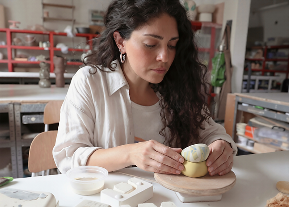
Slip-casting creates a consistent base form, but variation happens through the terrazzo process. I create marble porcelain sheets by mixing coloured porcelain and then cut fragments to build a composition, almost like a mosaic. When I’m happy with the pattern and colour balance, these pieces are applied during the slip-casting process. Each composition is different, so every box develops its own surface and character. Though they come from the same mould, the terrazzo patterns ensure that no two pieces are exactly alike.
4. The boxes are designed to be displayed together in different sizes and colourways. How important is the relationship between multiple pieces within the collection?
Displaying multiple boxes together enhances their presence. While the current pieces are presented in one size, the design is intended to expand into different scales and colourways. When grouped, the boxes create compositions reminiscent of pebbles on a shore, with contrasts and harmonies in form, colour, and pattern. These arrangements highlight subtle variations in surface and texture that might go unnoticed individually, inviting viewers to explore relationships between the objects and experience them as a collection.
5. The marbled porcelain surfaces resemble fragments of stone or terrazzo flooring. How do you approach colour composition to create these patterns?
I begin by testing different pigment proportions and combinations to find colours that complement each other. The marble patterns create contrasting veins and lines that reflect variations found in natural stone. Each terrazzo composition is layered by hand, subtly mixing coloured porcelain to build depth and irregularity. I aim for a balanced composition that feels organic and playful, where colour and pattern work together to create a tactile surface that invites closer inspection.
6. Your background in industrial design informs the development of the forms. How does this design perspective shape the balance between function and sculptural presence?
Industrial design taught me to consider ergonomics and functionality, whilst placing emphasis on the importance of the concept. The forms are designed to be practical— easy to handle and use—but also sculptural. Conceptually, I see the boxes as small objects to hold personal treasures, like jewellery, in a sense memories, creating an intimacy between the pieces and owner. Gentle curves and textures engage the eye while maintaining their function as everyday objects. This balance allows each piece to be both useful and visually meaningful.
7. The boxes are small, intimate objects intended for everyday use. How do you think about the relationship between functionality and tactile experience?
I consider how the object feels in the hand as much as how it functions. The scale, weight, and act of opening the lid invite interaction. There is also a tactile contrast between the glossy glazed container and the matte terrazzo lid, which highlights the textures of the materials. The boxes are designed to captivate, drawing the eye and whilst small, they have a strong presence. The combination of touch, weight, and form makes using each box a thoughtful experience.
8. Within The Invisible Made Visible, your work highlights subtle gestures within the making process. What aspects of craft do you hope viewers begin to notice when encountering these objects?
I want the pieces to invite curiosity and interaction. The marble patterns, colour contrasts, and mix of matte and glossy surfaces guide the eye and create a sense of individuality. By encouraging viewers to handle, compare, and explore the boxes, they can sense the care, skill, and subtle gestures behind each object, forming a quiet, tactile connection between the maker, the material, and the viewer.


PATTERN, PROCESS, AND QUIET INDIVIDUALITY
Review by Chih-Yang Chen, Art Director